Cherries Tea House


Category
Food & BeverageAbout This Project
“Cherries Tea House is a tea shop in Tainan. It has been more than ten years since the shop opened in 2001. This June, the shopkeeper commissioned me to design a new corporate identity system for a series of package.
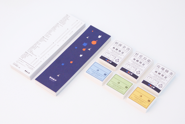
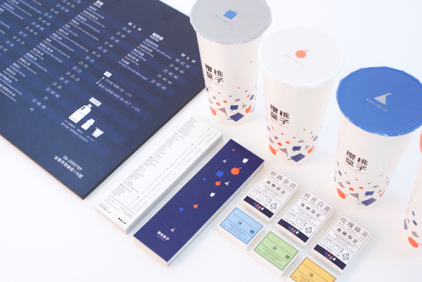
We use indigo as the main color and arrange four patterns with different colors in groups. Hoping that we can build a exquisite feeling. The four straight lines on the patterns mean cherry’s stem and straw. Stem is a part the image of cherry, and straw represents the drinking culture in Taiwan. According to my observation, there is no printer machine in the tea shop. They write down the order and it’s difficult to mark up on the cup. So I designed this sticker to note the amount of ice and sugar of each drink. The entire ordering process doesn’t change but it’s easier to distinguish different drinks, the look of the cup also becomes better.”
Designed by chin huan chou
